


a relocation app for new movers
Helping people relocate smoothly with a centralized platform for essential resources.
Project type: End-to-end app + branding
Role: Sole UX/UI designer + brand designer, with support from my mentor, Leena Chatlani
Industry: Relocation and Local Services
Tools: Figma and FigJam
Duration: Q4 2024 & Q1 2025

Introduction

- 22 year old adult“Moving takes a huge physical toll on my body.”
The Product
At Findr, our mission is to make moving exciting and stress-free by connecting individuals with nearby essentials and services tailored to their new location. With a youthful, fun, and modern approach, we aim to simplify the transition to a new home and empower our users to explore their surroundings with ease and confidence.

“The amount of research that goes into moving is super overwhelming.”
- 18 year old college studentThe Problem
About 27 million Americans move to a new place of residence each year, which is approximately 8.4% of the U.S. population according to the U.S. Census Bureau. Other than the actual tiring physical aspect of moving, the rebuilding of one’s space and basic daily schedule can also be time-consuming and exhausting.

- 24 year old adult“Uprooting my entire life and having to rebuild it again is extremely stressful.”
The Users
Upon learning more about the moving experience as a whole, we eventually narrowed our target demographic to young adults, either still in college or freshly graduated. Based on user research, it appears that young adults move more frequently than other age groups due to the current stage of their lives allowing more flexibility. Regardless, users of all demographics can benefit from this application.
Research
Research Goal
Our research goal was primarily to develop a better understanding of how the typical person is affected by a move. By understanding their process of approaching this move as well as their emotions during this time (both good and bad), we can better understand what works and what doesn’t work, thereby addressing it in our solutions.
Initial Research Objectives
-
Learn about personal experiences, both positive and negative, regarding moving to understand what works and what are some pain points.
-
Start breaking down daily routines that are drawn from personal experiences and pinpoint what gets disrupted.
-
Understand what people value in their living/social environment and assess if this is impacted by their move.
After narrowing down our specific focuses for our research, we then started to cultivate and craft our interview questions in order to better understand these experiences. We created these questions with the intention of keeping it open-ended and allowing participants opportunities to expand upon their answers and experiences.
After the initial interviews, we then grouped key findings and quotes into categories to find a common link. Upon further analysis, we found that the majority of my participants expressed frustration during a move due to having to relocate their basic essential resources and services relative to their new location. Some shared that their lifestyles revolve around these resources, so this disruption to their daily routines causes them significant levels of stress.
Research Style
To better understand user experience with moving, we conducted in-person user interviews to gather firsthand insights into their needs, frustrations, and thoughts. After all, we had to be sure that there was even a problem to begin with!


Analyzing Interview Transcripts


Define
Defining Parameters
We utilized an iterative approach in defining Findr’s structure by continuously testing and refining based on feedback. Continuously updating Findr’s structure ensured that all aspects of user needs aligned with each design decision. The primary deliverables created during this defining process were user personas, user flows, and task flows. These initial deliverables provided a strong foundation for the app’s design, which allowed for seamless adjustments and adaptations throughout the process.
User Personas
After drawing out common pain points and analyzing user interviews, I can begin to infer which specific demographic would benefit from Findr the most. Analyzing our user interviews and drawing out key points from our participant’s shared experiences allowed me to pinpoint a target demographic that would most benefit from Findr: young adults, varying from college students to adult movers in their 20’s. By interviewing our participants, we found that young adults tend to move more frequently than other age ranges due to their slightly more flexible life stages.
Task Flows
Narrowing down our focus, we also designed task flows in order to outline the specific steps required to complete a task. The primary task flow focuses on finding a nearby store, which is the core of our design. This prioritization can be seen in later iterations. Additionally, we created a secondary task flow for updating the user’s address within their profile; while this task flow is not seen in our design deliverables, we designed this with the intention of referencing it for future iterations.


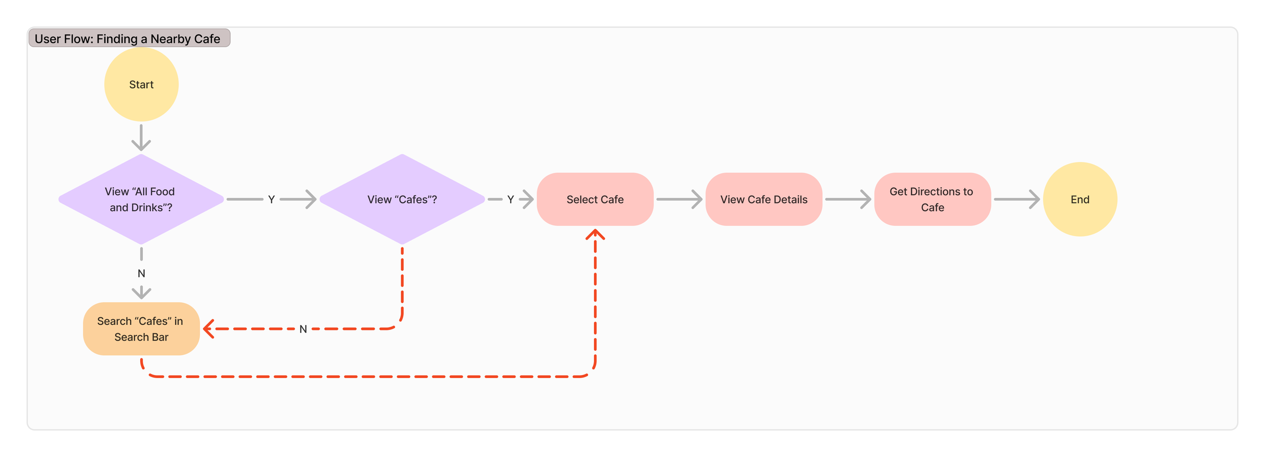

User Flows
Designing user flows was essential in streamlining Findr’s design process, as they ensured that the key tasks were intuitive and efficient. The two primary user journeys we focused on were signing up/logging in and finding a nearby store, as these two features will be the most frequently used.
Design
An Overview of the Design Process
Designing Findr was an iterative process; I explored a multitude of variations of each deliverable to ensure that the final product felt intuitive, engaging, and user-friendly. From color choice to typography, each decision was made with the intention of balancing functionality and approachability while also reinforcing Findr’s brand values: adventurous, fun, inviting, exciting, fresh, and vibrant.


Typography
I started this process off by establishing a scale and text size for headers and body text for both mobile and desktop, despite this app being designed for mobile devices, to ensure scalability and consistency for potential future adaptations.
I ended up choosing Poppins as the sole typeface for Findr; I just felt like having one font was simple, just like how I wanted the general design to be. As a geometric sans-serif font, Poppins presents a modern yet friendly aesthetic that matches Findr’s brand values. Furthermore, its balanced proportions helped with visibility across various scales.

Wireframes
Mid-Fi Wireframes


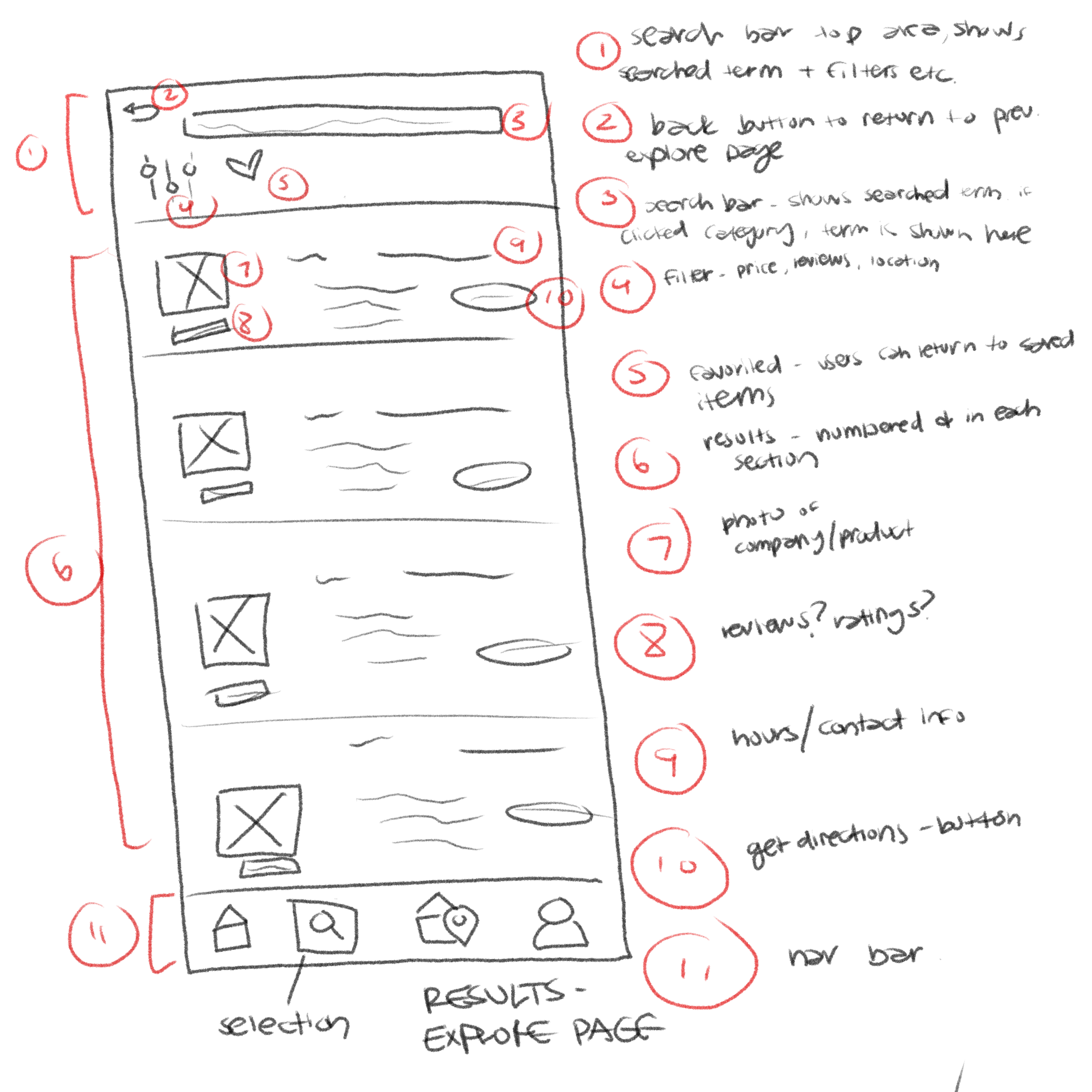
Throughout the design process, I explored multiple variations of sketches and brainstormed different layout possibilities and interactions through lo-fi wireframes. Once these lo-fi wireframes have been created and some structure/user flow has been established, we start narrowing down our focus and adding more details, translating these into mid-fidelity wireframes to refine functionality. Once the basic mid-fidelity wireframes have been established, I just continue to make iterations and changes until I’m content with where I am. After finding a place in which I was comfortable, I then converted these frames into high-fidelity wireframes and made any appropriate adjustments.
Lo-Fi Wireframes


Hi-Fi Wireframes


The logo design process initially kicked off with brainstorming and sketching multiple concepts, exploring various ways to visually present concepts such as “finding”, “cities”, “homes”, and “location”, all of which are tied to Findr’s core purpose. The ideal logo would be unique yet simple, ensuring that it’s easily recognizable but still scalable.
Ultimately, I chose the magnifying glass with a heart, as it struck the perfect balance between clarity and uniqueness. I refined this logo in Figma, testing three variations to ensure versatility and legibility across various sizes.
Icons

Branding
Findr’s color palette was cultivated to reflect the emotions tied to moving - a sense of refreshment, excitement, and nostalgia. I utilized a split complementary palette to add depth and vibrancy, emphasizing Findr’s brand values. The primary color is slightly soft yet rich green in order to evoke calmness, growth, and exploration. The secondary color is a reddish shade of purple, introducing a touch of nostalgia, which is often associated with moving, and also incorporating a sense of creativity, a foundational pillar to Findr’s identity.

Logo

I designed a set of custom icons in Figma to utilize in Findr’s design, especially its navigation bar which includes the profile, home, and map buttons. When designing these, I referenced commonly recognized symbols to minimize the learning curve so users can quickly understand their functions without too much hesitation or confusion. I incorporated rounded edges to these icons as roundness is often associated with warmth and approachability. I also tried to keep it relatively simple, as adding too much complexity could potentially cause the icons to be difficult to recognize.
Test
Usability Tests with a Prototype

I conducted task-based usability testing, asking participants to complete 4 primary flows. Participants were encouraged to think aloud while completing tasks and I was present as a spectator and potential facilitator in case any participants were stuck.


To ensure that Findr provided a seamless user experience, I conducted usability testing using an interactive prototype with the same pool of participants from my initial user interviews. By observing participants as they navigated the app, I could identify areas that worked well and pinpoint any potential pain points that needed iteration.
Testing Methods and Execution
Success Metrics and Key Findings
To set a baseline for quantifying usability, I set some performance benchmarks:
Account creation and login: Target completion time of under 1.5 minutes with fewer than 2 errors
Getting listed directions to a recommended restaurant: Target completion time of under 1 minute with fewer than 3 errors
Locating a business near home and accessing store details: Target completion time of under 2 minutes with fewer than 3 errors
Finding businesses in nearby cities: Target completion time of under 1 minute with fewer than 3 errors
In addition to these success metrics, I also assessed user confidence levels by using a numerical scale to gauge how comfortable participants felt with navigation.
The usability test results demonstrated that Findr’s core features were highly intuitive and easy to use. Based on the 5 usability charts, all users rated the experience between a 9 and 10 for ease of use, with 10 being the easiest. No participants encountered any errors or difficulties and each user completed the assigned tasks well under the target time constraints.
While there were no specific pain points, some participants reinforced specific design choices that stood out to them. The dropdown neighborhood selection was particularly well-received, with users appreciating its simplicity and convenience.


Conclusion
Working on Findr was an incredibly rewarding, unique experience that pushed me both creatively and strategically. One of the biggest challenges I faced was that this was the first real hands-on project over which I had full control, which was both liberating and slightly overwhelming. I often found myself overthinking my design choices, which sometimes slowed down my progress. I also found myself caught up in making sure every brainstormed idea was a “winner” rather than exploring freely and iterating more efficiently. However, over time, I’ve definitely improved in letting go and letting brainstorming sessions come naturally.
During this process, I’ve sharpened my communication skills and learned how to defend my design choices with clear reasoning whilst also remaining open to feedback. I’ve improved immensely at understanding different perspectives and recognizing when a suggestion improved my product.
Overall, this project was immensely special to me, as it was my very first and set up the foundational pillars of how I approach projects later to come. The ability to balance confidence in my work with adaptability will undoubtedly shape my future approach to UX Design.